Scene Concept overlay
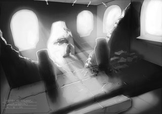
OK here it is, based on my comments on this piece I have added a wider range of tones and ambient lighting. I have reduced some of the rim lighting as it was a bit over done.
I've provided a zoomed out view of my photoshop page to show how Im using the paths tool as a guide for my perspective lines. I have them anchored at the vanishing points and I move them between the tangents as needed. I have tried to remain true to his orginal drawing whille keeping the perspective in tact.
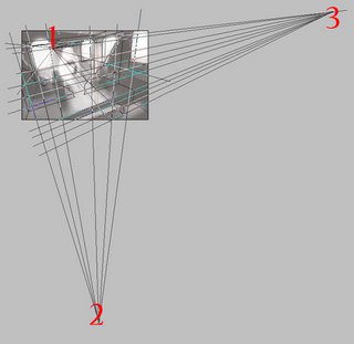
Dawuds drawing was an ambitious attempt at a 3 point perspective drawing with a tilted horizon line. This is a bit messy but I wanted to give you an idea of what the perspective break downs look like. If you want to get into concept drawing there's no escaping the need to study perspective drawing whether it be for vehicles, interiors or exteriors.
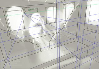

I've provided a zoomed out view of my photoshop page to show how Im using the paths tool as a guide for my perspective lines. I have them anchored at the vanishing points and I move them between the tangents as needed. I have tried to remain true to his orginal drawing whille keeping the perspective in tact.

Dawuds drawing was an ambitious attempt at a 3 point perspective drawing with a tilted horizon line. This is a bit messy but I wanted to give you an idea of what the perspective break downs look like. If you want to get into concept drawing there's no escaping the need to study perspective drawing whether it be for vehicles, interiors or exteriors.


 Strictly for promotional purposes. This is a non profit endeavor.


2 Comments:
Thanks! I am working on my perspective now - we should see improvements in my nexts posts.
God does this make my head hurt. My perspective is so bad. I really want to improve. thanks for the motivation.
Post a Comment
<< Home