jam submission
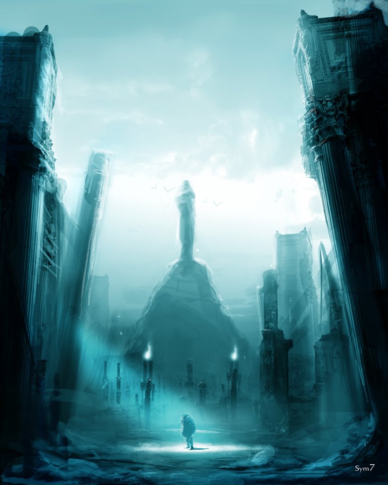
instead of even laying pencil to paper . i chose this time to just shoot from the hip and make the submission more an impression of what i wanted to convey. loose but to the point .
posted by sym7 at 12:32 AM
![]()
![]()
With the help of some friends, I have compiled a roster of talented artists to contribute to a weekly sketch jam by invitation only. Every week or so we will settle on an idea and will each take a stab at illustrating the concept. The level of completion can be anything from a rough sketch to a finished rendering. This blog is intended, for those who are involved, to be an opportunity to challenge one another, to challenge ourselves, and to connect with our contemporaries in the field.
posted by sym7 at 12:32 AM
![]()
![]()

 Strictly for promotional purposes. This is a non profit endeavor.


10 Comments:
Your killin' me son.... killin' me. this is fire. blue fire. Now if you'll excuse me I have to sell my drawing table and go to refrigerator repair school. LOL. Awesome!
Damn dude, this is gorgeous! Those shadows and higlights really convey drama. A nice touch with the spot light.
Awesome use of shadows, tone. you nailed it!
i have all ther layers ill try to do a shot of them to show how it was done. . its very simple and very quick . its a good ways to break using line its all about broad tone , . thanks guys ,
Wow. This is almost exactly what I pictured fitting the them, a figure with looming buildings/monuments around. I do love the blue monotone, and this does convey a lot of feeling by your used of scale.
sym 7 this is excellent. Your image conveys lots of emotion. For a number or reasons.
1.) CONTRAST!!
you use contrast on 2 levels that I can observe. the city vs. character and the light vs. dark. The size of the city compared to the tiny character is very good. Contrasting the two really draws me in.
2.) COMPOSTION!
Your choice to place your character at the bottom of your composition. Leaving our eyes to travel around the world u designed. And also directing our eyes to your character with that light.
3.) COLOR!
haha. Blue is the color of lonliness. What more can i say. great choice!
Great sketch man.
Please if u could explain your thought process to us. Tell us what u were trying to?
do u feel like you were succesful?
thanks
Jamal
sat down and gave myself an hour and half time frame. so no matter what it looked like that was going to be it. i chose a lower eye level simple one point perspective vantage point. i made a layer marking the perspective so this way i could at least keep this in mind.
then i made a gradient. going from dark to light from the bottom to the top. then with a huge broad brush drew big shapes. i wasn't sure what i was going for or fully but i wanted to cover the screen, so i broke the layers down to the dark zone. middle zone. light zone. originally that statue in the distance was going to be a person on top of some land mass. later i changed the scale. to give something else to refer to in relation to the human in the image.
i knew to have the human stand out i wanted to cross cut a band of light to guide the eye. and left the most distinct contrast here. i was going o make the light a warm light but kept the whole thing blue. the fore ground being bluish purple and the farther layers blue green. if u did a hue/ saturation change on this it would have a totally different feel. value changes to this could have made this a lost underwater city. etc. etc. its generic.
if u notice at the top of the buildings i used a pillar shot i used it in the spot cloest to the viewer and to frame the edge of the sky . and to add a bit of deail where painting it would take me a bit longer . its adds detial at the edge agaist the sky for the highest contrast in the foreground its obvious if u look at the top .other wise this image is a series of shapes. kept simple and highlighted .
This comment has been removed by a blog administrator.
cool man thanks for letting us hear about your process a little.
great sketch
peace
Post a Comment
<< Home